Web Design Colombo: Mobile-First for 85% Smartphone Users in Sri Lanka
The Mobile Reality: Why Colombo Businesses Must Adapt
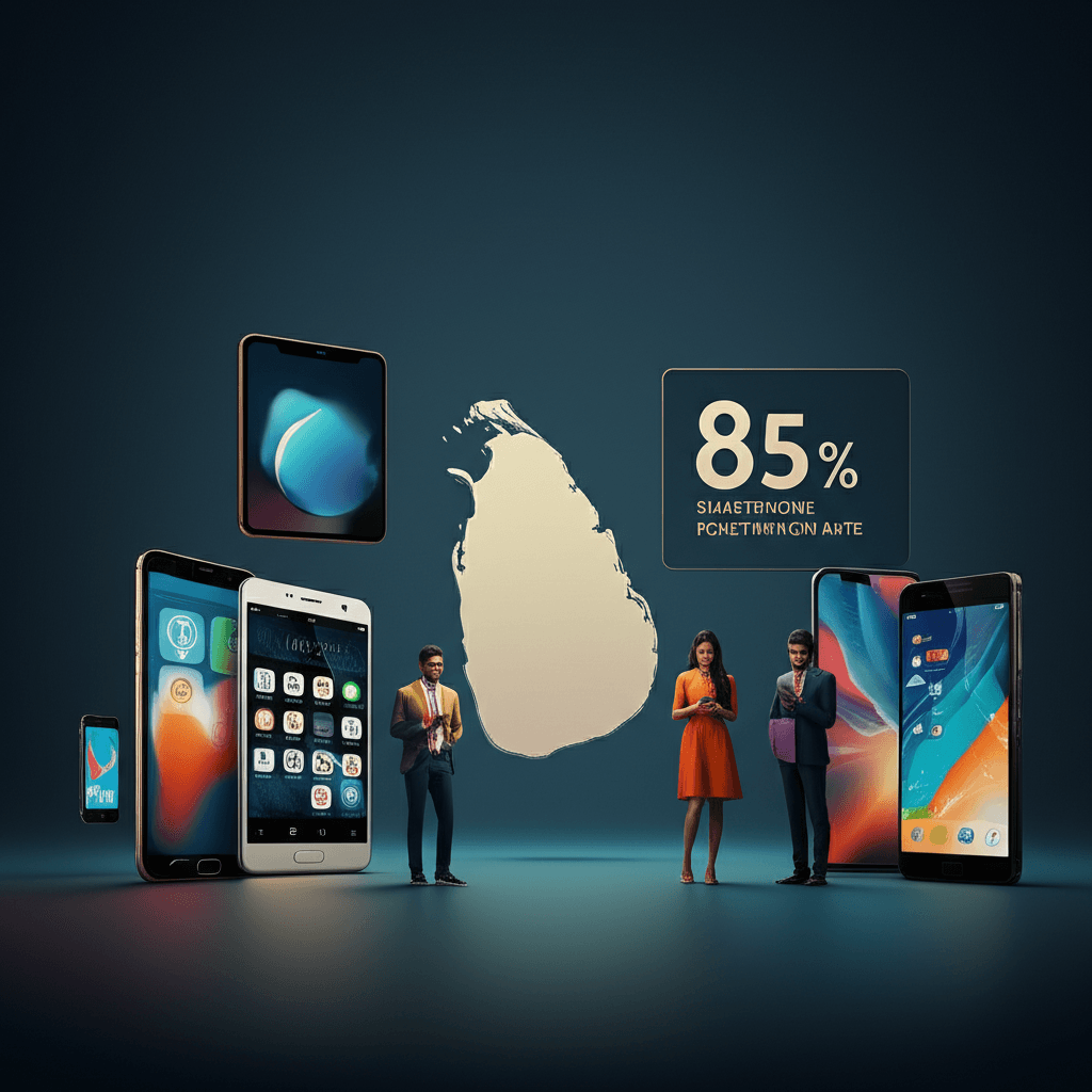
The way people in Sri Lanka use the internet has changed. Today, around 85% of users access the web through their smartphones. This is not a future trend; it is the reality right now. For any business in Colombo, this number is too big to ignore. Your customers are not sitting at a desk. They are searching for products, services, and information on their phones while on the go.
This shift means the old way of designing websites is no longer effective. In the past, websites were built for large desktop screens first, and the mobile version was an afterthought. This often resulted in a site that was slow and hard to use on a small screen. Users had to pinch and zoom just to read text or tap on tiny buttons. This frustrating experience can quickly drive a potential customer away.
A mobile-first approach flips this process around. It means designing the website experience for the smallest screen—the smartphone—first. This ensures the site is fast, easy to navigate, and looks great on the device most people use. Important information is clear, buttons are easy to tap, and the overall performance is smooth. A positive mobile experience is crucial for keeping visitors engaged and is a key factor in optimizing your website’s performance for search engines like Google.
For Colombo businesses, adapting to this mobile reality is essential for survival and growth. A website that works perfectly on a phone is no longer just a nice feature; it is a basic requirement. It is the foundation of what it really takes to create a successful website in today’s digital landscape. By meeting customers where they are—on their mobile devices—you can build a stronger connection and drive better results for your business.
Deconstructing Mobile-First: More Than Just a Smaller Screen
Many people believe that mobile-first web design simply means a website looks good on a small screen. While that’s part of it, the real strategy is much deeper. It’s a complete shift in how we think about building websites for businesses in Colombo and across Sri Lanka.
In the past, designers would create a large, complex website for a desktop computer. Then, they would try to strip away features and content to make it fit on a phone. This old method, called “graceful degradation,” often resulted in a slow and clumsy mobile experience.
Mobile-first flips this process around. We start by designing for the smallest screen—the smartphone. This forces us to focus on what is most important for the user. We ask critical questions:
* What is the main goal of a mobile visitor?
* What is the most essential information they need?
* How can we make it easy for them to take action with just a thumb?
This approach leads to a cleaner, more focused design. It prioritizes speed, which is crucial for users on mobile data networks. Fast-loading pages are essential for keeping visitors engaged, a key component of optimizing Core Web Vitals.
Once the core mobile experience is perfected, we then add features and expand the layout for larger screens like tablets and desktops. This method, known as “progressive enhancement,” ensures that your website is not just usable but truly effective on every device. By building a scalable foundation from the mobile version up, your site will serve every customer well, whether they’re on a phone in a café or a desktop in an office.
Pillars of an Effective Mobile-First Website for the Sri Lankan Audience
With most Sri Lankans using smartphones to browse the internet, your website must be built for the small screen first. A mobile-first design is no longer an option—it is essential for success. To connect with this audience, your website should be built on four key pillars.
1. Lightning-Fast Speed
Mobile data speeds can vary across Sri Lanka. A slow-loading website is one of the main reasons visitors leave. Your site must be optimized to load quickly, even on a weaker connection. Focusing on technical details like optimizing Core Web Vitals ensures a smooth and fast experience that keeps users engaged.
2. Simple, Thumb-Friendly Navigation
Think about how people hold their phones. Menus, buttons, and links should be large enough to be tapped easily with a thumb. Navigation must be clear and simple, helping users find what they need in just a few taps. A cluttered or confusing mobile site will frustrate visitors and drive them away.
3. Localized Experience and Payments
Your website should feel familiar to a Sri Lankan user. Display prices clearly in Sri Lankan Rupees (LKR). More importantly, offer payment methods that people know and trust. Integrating localized payments for Sri Lankan DTC brands using FriMi and Dialog Axiata can significantly increase customer trust and sales.
4. Readable and Scannable Content
People read differently on their phones. They tend to scan for key information. Use short sentences, small paragraphs, and clear headings. Make your text large enough to be read comfortably without zooming in. This ensures your message gets across quickly and effectively to a busy, on-the-go audience.
Partner with Colombo’s Mobile-First Experts for Tangible Results
Choosing the right web design partner is a critical step for your business. In a market where most customers will find you on a smartphone, you need more than just a beautiful website. You need a powerful digital tool that works perfectly on small screens and delivers real, measurable results.
Our Colombo-based team understands the Sri Lankan market. We don’t just build websites; we create digital experiences designed for your mobile audience. Our process focuses on what truly matters: speed, ease of use, and clear calls to action. We ensure your site loads quickly and provides a smooth journey for every visitor, which is essential for keeping them engaged. This focus on performance includes optimizing Core Web Vitals to meet modern standards.
We believe in building partnerships that lead to growth. A successful website should attract new leads, drive sales, and strengthen your brand. We specialize in building scalable platforms that can grow with your business, whether you are a small startup or an established company. Let us help you turn your online presence into a key asset that generates tangible returns.
Ready to connect with Sri Lanka’s 85% mobile user base? Contact us today to discuss how we can build a mobile-first website that achieves your business goals.
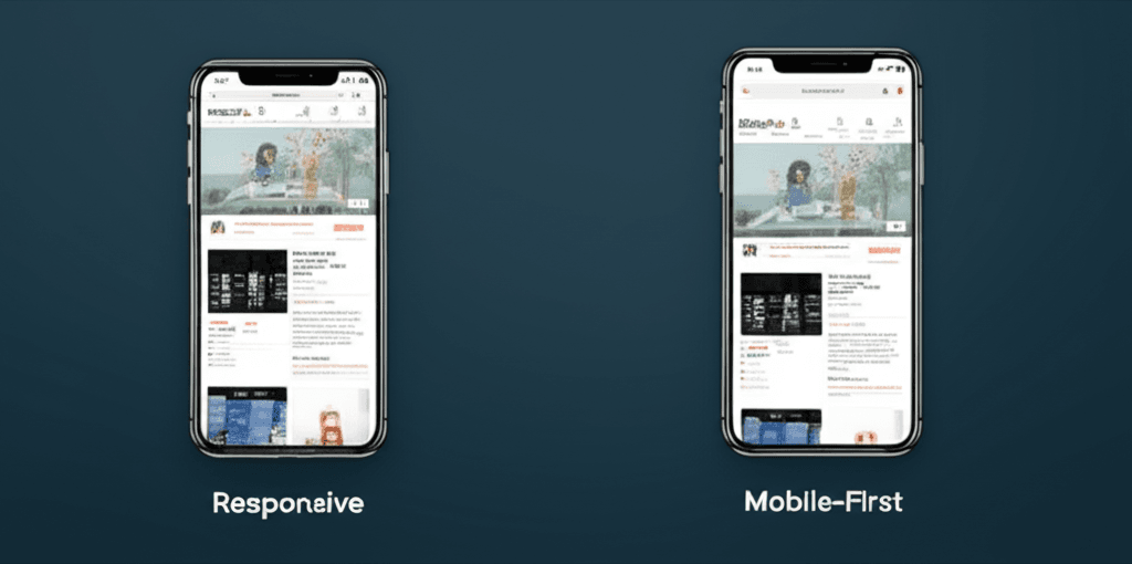
{“@context”:”https://schema.org”,”@type”:”FAQPage”,”mainEntity”:[{“@type”:”Question”,”name”:”What is mobile-first web design?”,”acceptedAnswer”:{“@type”:”Answer”,”text”:”Mobile-first web design is a strategy where the design process starts with the smallest screen (a smartphone) and then scales up to larger screens like tablets and desktops. This ensures the experience is optimized for the majority of users who are on mobile devices.”}},{“@type”:”Question”,”name”:”Why is a mobile-first approach crucial for businesses in Sri Lanka?”,”acceptedAnswer”:{“@type”:”Answer”,”text”:”With over 85% of Sri Lankan internet users on smartphones, a mobile-first website is essential. It leads to faster load times, a better user experience, improved SEO rankings on Google, and ultimately, more leads and sales for your business in a mobile-dominant market.”}},{“@type”:”Question”,”name”:”Is ‘mobile-first’ the same as ‘responsive’?”,”acceptedAnswer”:{“@type”:”Answer”,”text”:”Not exactly. While both aim for good multi-device experiences, their approach differs. Traditional responsive design often starts with a desktop site and adapts it down. Mobile-first prioritizes the mobile experience from the very beginning, leading to a cleaner, faster, and more focused result for mobile users.”}}]}


