I remember my first attempt at building a dark theme. I naively swapped the primary text and background colors in the CSS and called it a day. The result was a jarring, high-contrast mess where our bright brand colors vibrated against the pure black background and my carefully crafted drop shadows simply vanished. It was a humbling lesson. That’s when I realized creating a proper dark mode is far more than a simple color inversion; it’s a complete reconsideration of your visual language.
A truly adaptive design respects the user’s context—whether they’re in a dimly lit room or just prefer a darker interface for focus. It’s an act of empathy, listening to their system-level choice through the prefers-color-scheme media query. This requires a thoughtful approach to your entire color system, from desaturating accent colors to rethinking how you communicate elevation and depth on a dark canvas.
So, how do you move beyond a basic toggle and build a website that feels native in both light and dark? We’ll get into the practical steps, from structuring your design tokens for theming to the specific accessibility checks that will make your design comfortable and legible for everyone, no matter their preference.
The Rise of User Choice: Why Theme Toggling is the New Standard
I remember a time, not so long ago, when “dark mode” was a secret handshake. It was a hidden setting in a code editor or a custom skin for a niche forum, a choice you had to actively seek out. It felt like an insider’s feature. Now, my phone automatically switches my entire digital world to a darker palette at sunset, and I barely even think about it. The secret is out, and it has become a baseline expectation.
This shift wasn’t driven by a single app. It was systemic. When Apple and Google integrated system-wide dark modes into iOS 13 and Android 10, they flipped a switch for millions of users overnight. Suddenly, people weren’t just choosing a theme for one app; they were setting a preference for their entire device. This gave developers a powerful tool: the prefers-color-scheme CSS media query. It allowed websites to automatically listen to and respect the user’s OS-level choice, making theme adaptation effortless.
The result is a powerful new user expectation. When a user has their phone set to dark mode and they open a website that blinds them with a pure white background, the experience feels broken. It’s an interruption. Apps like Twitter and Slack understood this early on, offering not just a toggle but also an “auto” or “system” setting that syncs with the device. This demonstrates a respect for the user’s established context.
Ultimately, this is about more than just aesthetics or reducing eye strain. It’s about agency. Giving users control over their digital environment—letting them decide what is most comfortable for their eyes, their environment, or simply their mood—is a fundamental sign of respect. It turns a one-size-fits-all product into a personal space. And in a world of constant notifications and digital noise, that small piece of control makes a huge difference.
Light Mode: The Pros and Cons of the Classic Default
I remember spending summers reading paperbacks in the backyard, the black ink sharp and clear against the white pages under the bright sun. There’s a reason we’ve printed books that way for centuries. Our eyes are simply built for it. Dark text on a light background mimics that classic, high-contrast experience, which is why it became the digital standard.
Now, you might be wondering if that long-held tradition still holds up on a glowing screen. For the most part, it does. In a well-lit office or during the day, light mode generally offers superior readability for long passages of text. Your iris constricts to let in less light, which can help you focus more sharply on the details of the letterforms. This is why content-heavy sites—think news outlets like The Guardian or detailed documentation pages—have stuck with it. It’s familiar, it’s legible, and it just works.
The Glare and the Drain
But it’s not a perfect system. Stare at that same bright white screen in a dim room, and you’ll start to feel it. The intense light can create a “halo” effect, causing what we call digital eye strain. Your eyes work overtime to handle the glare. There’s also a practical hardware consideration: on modern OLED screens, every white pixel is individually lit. A mostly white interface, therefore, consumes significantly more battery power than a dark one where pixels are simply turned off. For a user on a low-power device, that’s a tangible drawback.
Ultimately, light mode remains the undefeated champion for environments where information density and clarity are key. Imagine trying to compare the subtle color variations of a product on an e-commerce site against a black background; the surrounding light from a white page provides a much more neutral and accurate context. It’s the reliable default for a reason, but its dominance is rightly being challenged by context and user comfort.
Dark Mode: More Than Just a Stylish Trend?
I remember a project deadline years ago, coding deep into the night. The only light in the room was the stark white glare of my editor. Every time I looked away from the screen, I saw a bright rectangle burned into my vision. That experience is why the arrival of system-wide dark modes felt like such a relief. For many of us, it’s the default setting for reducing that harsh glare in low-light environments.
The benefits can go beyond simple comfort. On devices with OLED or AMOLED screens—which includes most modern smartphones—dark mode can significantly extend battery life. Unlike LCDs, these screens don’t use a universal backlight; a black pixel is simply an off pixel. That’s a real, measurable power saving. Aesthetically, a dark theme also creates a dramatic backdrop that makes vibrant images and videos pop, which is why platforms like Netflix and Spotify adopted it so effectively.
But designing a good dark mode isn’t as simple as inverting colors. Pure white text on a pure black background can cause an optical effect called ‘halation,’ where the letters appear to bleed into the dark, reducing legibility for some users. This is why you’ll see experienced design systems, like Google’s Material Design, recommend using a dark gray (like #121212) for surfaces instead of pure black. It softens the contrast just enough to improve readability without losing the intended effect.
So where does it shine brightest? We see it used best in specific contexts:
Media-heavy platforms where the interface should fade into the background.
Complex data dashboards where color-coded charts need to be the focus.
Developer tools and code editors, where long hours are spent concentrating on text.
In these situations, dark mode stops being a trend and starts feeling like a functional necessity.
The Designer’s Checklist for a Dual-Theme Website
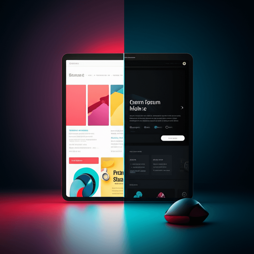
I still cringe thinking about my first dark mode project years ago. I proudly wrote a few lines of CSS to invert the entire color scheme, and the result was a mess. The logo looked broken, bright photos felt like staring into a spotlight, and the pure white text on a pure black background gave me a headache. I learned a hard lesson that day. Here’s the part most people miss: a good dark theme isn’t an inversion; it’s a translation. You’re crafting a second, parallel design system, not just flipping a switch.
Start by stepping away from pure black. A background of #000000 creates harsh contrast that can cause text to blur, an effect known as halation. Instead, build your palette from a base of dark gray, like Google’s recommended #121212, and use lighter grays for elements at different “elevations” to create a sense of depth. The same principle applies to text. Pure white can feel too intense, so opt for a slightly muted off-white. You might also find that fonts appear bolder in dark mode; sometimes dropping the font weight a notch (from Medium to Regular, for example) maintains the intended visual hierarchy perfectly.
Your visuals need their own translation, too. A vibrant photograph that pops on a light background can be overwhelmingly bright on a dark one. For one e-commerce site I worked on, we found that slightly desaturating product images by about 15% for the dark theme made them sit more comfortably in the design. For icons, SVGs are your best friend since their fill color can be controlled with CSS, making them adapt effortlessly. And through it all, keep accessibility as your guide. Your job isn’t done until both your light and dark themes meet WCAG standards, ensuring a contrast ratio of at least 4.5:1 for normal text. It’s the only way to build an experience that truly works for everyone.
Implementation: How to Code an Adaptive Theme
I still remember the first time a website just knew. I’d switched my laptop to Dark Mode for a late-night work session, and upon visiting a developer’s blog, the page loaded with a soothing charcoal background and crisp white text. There was no flash of a white screen, no fumbling for a toggle. It felt like a small bit of magic, a silent, respectful handshake between my OS and the browser. That “magic” is surprisingly straightforward to implement.
Automatic Detection with CSS
The foundation of any adaptive theme is respecting the user’s system-wide preference. You can listen for this setting directly in your stylesheet using the prefers-color-scheme media query. It’s a simple yet powerful feature that asks the operating system, “Is the user currently in light or dark mode?” Based on the answer, you can apply a different set of styles. This is your baseline—the most elegant, zero-effort experience for the user.
Efficient Theming with CSS Variables
To avoid writing messy, repetitive overrides, the best practice is to use CSS Custom Properties (variables). You define your core color palette—like background, text, and accent colors—on the :root selector for your default light theme. Then, inside the @media (prefers-color-scheme: dark) block, you don’t rewrite rules for every element. Instead, you simply redefine the values of those same variables. Every component that uses var(--background-color) will update automatically. It’s clean, maintainable, and incredibly efficient.
Building a Manual Override
Automatic is great, but choice is better. Some users want a light website on a dark OS, or vice versa. This is where a user-facing toggle comes in, powered by a little JavaScript. When a user clicks the button, you can add a class (e.g., .dark-theme) to the element and use your stylesheet to respond. The crucial step is saving this choice. By using localStorage.setItem('theme', 'dark'), you store the user’s preference in their browser. On their next visit, your script should first check Local Storage for a saved preference before falling back to the system’s setting. Modern frameworks like Tailwind CSS streamline this even further, with built-in dark: variants that handle all the underlying logic for you.
Handing Over the Switch
I remember squinting at my phone late one night, the bright white of an article feeling like a spotlight in the dark room. That small moment of discomfort is something our users feel every day. The debate over dark versus light mode was never about picking a winner; it’s about acknowledging that needs change with the light and the environment. The most thoughtful design choice we can make is to hand over the switch. Building an adaptive interface is a gesture of respect for the user’s comfort and context. So, open up your design files today. Look at your color palette not as a single statement, but as a flexible system, and begin planning how you can offer that simple toggle—that small piece of control that makes all the difference.
Frequently Asked Questions
Is dark mode actually better for your eyes?
It can reduce eye strain in low-light environments, but for some people, light text on a dark background can cause a 'halation' effect, making it harder to read. The best mode often depends on ambient lighting and individual preference.
Does dark mode save battery life?
Yes, but primarily on devices with OLED or AMOLED screens, where black pixels are truly off and don't consume power. On traditional LCD screens, the battery savings are negligible as the backlight is always on.
Should every website have a dark mode?
While it's a popular user-centric feature, it's not mandatory for every site. It provides the most value for content-heavy platforms or web apps where users spend extended periods. The decision should be based on your audience, content type, and available resources.