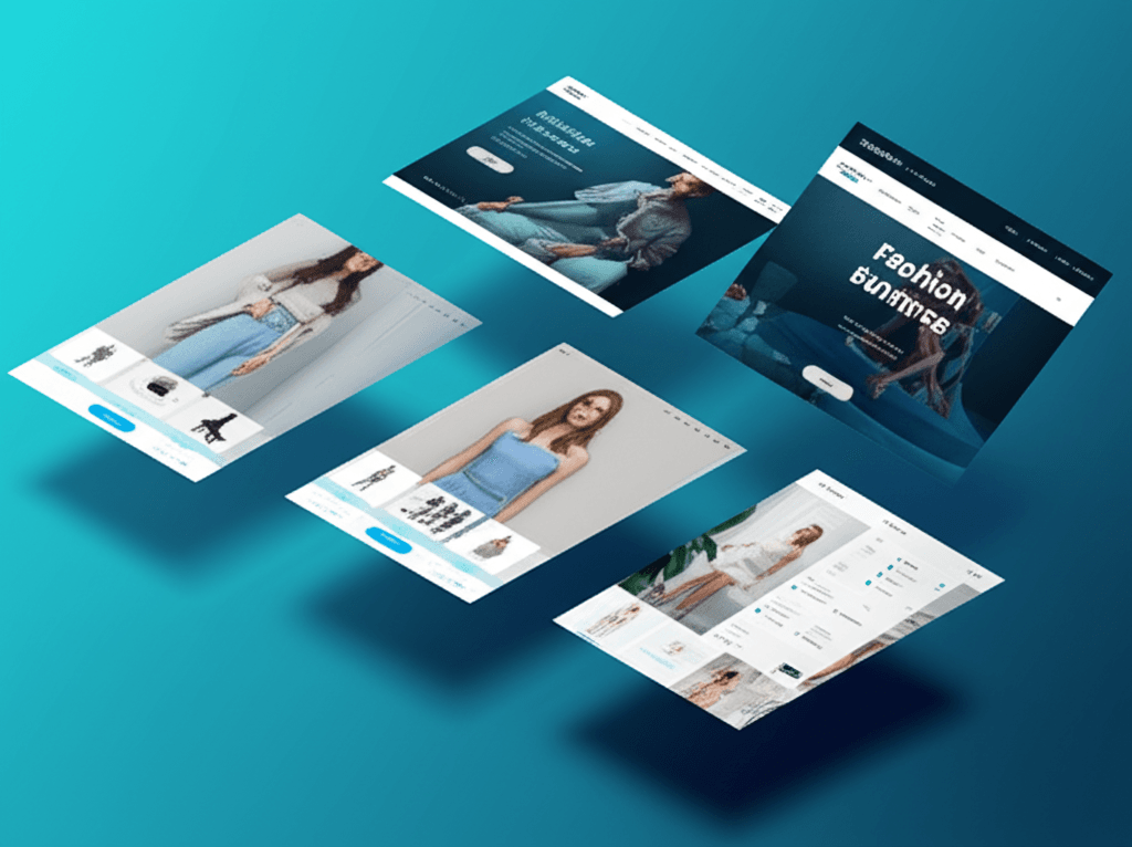
A web design that doubles sign-ups for a SaaS company can actually cut an e-commerce store’s revenue in half. This isn’t a theory; it’s a costly mistake businesses make when they apply a one-size-fits-all approach to their digital storefront. You’ve likely seen a slick, minimalist design on a tech site and thought, “That’s the look for us.” But after you implement a similar style, your add-to-cart rate drops, or your service-based lead forms go completely ignored. The frustration is immense because the design looks good, but it simply doesn’t perform.
The failure doesn’t lie in the aesthetics, but in the psychology and user intent. The goals are fundamentally different. An e-commerce site must remove all friction on the path to a quick purchase. A SaaS platform needs to educate and build trust for a long-term commitment. A service business has to establish authority and guide a visitor toward a conversation.
Forget generic best practices. Here, we’ll dissect the specific conversion architecture for each of these business models. You’ll learn exactly why a multi-step checkout can be fatal for e-commerce, how to structure a pricing page that converts for SaaS, and the precise trust signals a service-based site needs on its homepage to generate qualified leads. You will walk away knowing which rules to follow—and which to break—for your specific industry.
The Foundation: Universal Web Design Principles for Any Industry
Ever launched a website that looked stunning but failed to convert? It’s a common and deeply frustrating experience. You invest time and money into a beautiful design, only to see high bounce rates and low engagement. The issue often isn’t the color palette or the font choice; it’s a crack in the foundation. Before we tailor a site for a specific industry, we must first build on solid, universal principles that apply to everyone, from a local plumber to a global SaaS company.
Build for Mobile, Then Desktop
The conversation is over: we live in a mobile-first world. More than half of all web traffic comes from smartphones, so designing for a desktop and then shrinking it down is a recipe for failure. A truly responsive, mobile-first approach means your design starts with the smallest screen, ensuring the core experience is functional and fast. This isn’t just about aesthetics; it’s about survival. A website that takes more than three seconds to load on a 4G connection loses visitors before they even see your headline. Your design must be lean and purposeful from the ground up.
Create an Effortless Path
Your website is not a maze. A user should land on your page and immediately understand where they are and how to find what they need. This is achieved through intuitive navigation and a strong visual hierarchy. For example, on a service website, the “Request a Quote” button should be the most prominent element on the page, using color, size, and placement to draw the eye. Don’t make users hunt for information. A clear user flow anticipates their needs and guides them from point A to point B with zero friction.
Design for Everyone
Web accessibility is not an optional extra—it is a fundamental component of professional web design. Adhering to the Web Content Accessibility Guidelines (WCAG) ensures that people with disabilities can use your site effectively. This means providing alternative text for images, ensuring sufficient color contrast, and making your site navigable via a keyboard. Beyond the ethical imperative, accessible design benefits all users by creating a more logical, predictable, and user-friendly experience.
E-Commerce Web Design: Driving Sales and Customer Loyalty
You’ve spent a small fortune on ads, your traffic numbers are climbing, but your sales are flat. Every click feels like a missed opportunity, and you’re left staring at a mountain of abandoned carts, wondering what went wrong. It’s a uniquely frustrating position—getting people to the door is hard enough, but getting them to buy can feel impossible when something is off.
Here’s what really matters though. An e-commerce site isn’t a digital brochure; it’s your best salesperson, your store manager, and your checkout counter all rolled into one. Its primary job is to remove every ounce of friction between a visitor’s desire and their purchase. When design gets in the way, sales stop. When it guides the customer, sales grow.
Show, Don’t Just Tell
Customers can’t touch or try on your products, so your design must compensate. This starts with compelling visuals. Invest in high-resolution product photography from multiple angles, a 360-degree view, and short videos showing the item in use. For a backpack, for instance, don’t just show the bag. Show it being packed, show the laptop sleeve in action, and show someone comfortably wearing it on a hike. This answers questions before they’re even asked and builds confidence.
Make Finding Products Effortless
Imagine walking into a massive department store with no signs. That’s what a site with poor navigation feels like. Implement intuitive categories and, most importantly, a powerful search with faceted filtering. A customer looking for a shirt should be able to instantly filter by size, color, material, and fit. The goal is to get them from the homepage to their perfect product in three clicks or fewer. The easier you make it to find, the easier you make it to buy.
The Path to Purchase
Your calls-to-action—especially the ‘Add to Cart’ button—should be impossible to miss. Use a contrasting color that stands out from your brand palette. Once they’ve added an item, the checkout process should be a masterclass in simplicity. Use a multi-step progress bar (e.g., Shipping > Payment > Review) so customers know exactly where they are. Offer a guest checkout option. Nothing kills a sale faster than a mandatory “Create an Account” page. Finally, build a foundation of trust right on the product page with customer reviews and star ratings. Placing this social proof near the price directly addresses a buyer’s biggest hesitation: “Will I regret this purchase?”
SaaS Web Design: Fostering Trust and User Onboarding
You land on a website for a new software tool, full of vague promises and confusing jargon. Ten seconds in, you still can’t answer a simple question: “What problem does this actually solve for me?” This frustration is common because SaaS companies aren’t selling a physical item; they’re selling an intangible solution. The website’s primary job is to make that abstract value feel concrete, trustworthy, and urgent.
The first step is crafting a razor-sharp value proposition that sits directly ‘above the fold.’ It must immediately tell visitors what your product is, who it’s for, and the primary benefit it delivers. A great headline doesn’t just describe; it promises a better outcome. Think less about your technology and more about the user’s relief or achievement. For example, instead of “AI-powered scheduling,” try “The scheduling tool that books meetings for you, so you can focus on your work.”
From Features to Tangible Benefits
Once you’ve made your promise, you have to explain how you deliver on it. This is where many sites devolve into a list of technical features. Instead, use a feature-benefit framework. Connect every feature directly to a user outcome.
Feature: Real-time collaboration
Benefit:“Stop emailing documents back and forth. Edit reports with your team at the same time and finish projects twice as fast.”
This simple shift in perspective moves the conversation from what your software is to what your customer can do with it.
Speaking of which, making a claim is one thing; proving it is another. This is where social proof becomes your most powerful asset. Prominently display the logos of companies that use your product. Use testimonials that include a full name, title, and company—specific quotes about solved problems are far more convincing than generic praise. For pricing, design tables that are transparent and easy to compare. Clearly highlight the differences between tiers, guiding users to the best fit rather than overwhelming them with checkmarks.
Finally, make the next step effortless. Your call-to-action (CTA) should match your product’s complexity. If your tool is self-explanatory, a “Start Free Trial” with a simple email and password form is perfect. For a more complex enterprise solution, a “Request a Demo” CTA sets the right expectation for a guided conversation. The goal is to remove every ounce of friction between a visitor’s interest and their first real experience with your product.
Service-Based Business Web Design: Building Credibility and Generating Leads
You’ve poured everything into your consulting firm. You have a beautiful website, a slick logo, and a compelling mission statement. So why isn’t the contact form getting any action? The silence can be deafening. Often, the problem isn’t what you’re selling; it’s that your website isn’t selling you. Your prospects aren’t buying a product they can hold in their hands. They are buying your expertise, your process, and a promised result. They are buying trust.
Speaking of which, building that trust online doesn’t happen by accident; it’s a deliberate act of design and content strategy. Unlike e-commerce, where the product is the hero, for a service business, you are the product. Your website must function as your most effective, hardest-working salesperson.
Show, Don’t Just Tell, Your Expertise
Vague promises like “we deliver results” are meaningless without proof. This is where case studies and a well-curated portfolio become your most powerful assets. Instead of just listing “SEO Services,” a digital marketing agency should feature a case study titled: “How We Helped a Local Bakery Triple Its Online Orders in 6 Months.” Structure it simply: outline the client’s initial problem (low visibility), detail your specific solution (a targeted local SEO and content strategy), and present the quantifiable result (a 300% increase in web-based orders). This provides tangible proof of your value.
Put a Face to the Name
People hire people, not faceless corporations. Ditch the generic stock photos of smiling models in a boardroom. Invest in professional, high-quality photos of you and your actual team. These images should convey both competence and approachability, helping a potential client feel like they know who they’d be working with. Consistent branding—using the same colors, fonts, and tone of voice across every page—further reinforces that you are an organized and professional operation.
Make the Next Step Obvious
When a potential client is convinced, their immediate question is, “What do I do now?” Don’t make them hunt for the answer. Your phone number should be in the header. A clear call-to-action button like “Schedule a Free Consultation” should be visible on every single page, often both at the top and bottom. To seal the deal, place your strongest client testimonials right next to these contact forms. Seeing a glowing review from a happy client is often the final nudge someone needs to make contact.
Choosing the Right Tech Stack for Your Industry
Ever stare at a list of website platforms—WordPress, Shopify, Webflow, React—and feel completely overwhelmed? You’re not alone. Choosing the wrong foundation is a costly mistake, leading to frustrating limitations and expensive rebuilds down the line. The secret isn’t finding the one “best” platform; it’s matching the technology to your specific business model.
For E-commerce Businesses
If you sell physical or digital products, your primary needs are secure payment processing, inventory management, and shipping logistics. Out-of-the-box solutions are your best bet.
Shopify and BigCommerce are excellent for most stores, offering integrated systems for everything from product variants to automated tax calculation.
Magento (Adobe Commerce) suits large-scale enterprises with complex catalogs and a need for deep customization, but it requires significant development resources.
For SaaS (Software as a Service)
SaaS companies have a unique dual need: a marketing site to attract users and a web application for paying customers. It’s often best to separate these.
Use Webflow for your marketing site. It offers incredible design freedom without needing to write code, perfect for landing pages and feature tours.
The actual user-authenticated application is typically a custom build using a framework like React or Vue.js. This provides the power needed for complex dashboards and data handling.
For Service-Based Businesses
If you sell services—consulting, design, legal advice—your website is a lead-generation engine driven by content and credibility.
WordPress is the undisputed leader for content marketing. Its powerful SEO plugins and massive ecosystem of themes make it ideal for blogging and building authority.
For professionals who need a polished, beautiful site quickly without a steep learning curve, Squarespace is a fantastic choice. Its templates are professional and its editor is very intuitive.
From Frustration to Function
Staring at a beautiful website that doesn’t convert can be incredibly frustrating. You follow the general rules, yet visitors leave without buying, signing up, or making contact. The disconnect often isn’t in the aesthetics, but in the strategy.
The most powerful shift you can make is to stop designing a “website” and start building an experience tailored to your industry’s unique customer journey. Whether that journey ends in a purchase, a subscription, or a consultation call, every element must guide the user toward that specific goal. This intentional alignment is what turns a passive digital brochure into an active engine for growth.
Ready to build a website that drives results for your specific industry? Contact our web design experts today for a free consultation. Imagine what a purpose-built digital experience could achieve for your business.
Frequently Asked Questions
What is the most important element in e-commerce web design?
High-quality product visuals and a seamless, trustworthy checkout process are the most crucial elements. Great imagery sells the product, while an easy checkout minimizes cart abandonment and converts shoppers into customers.
How does SaaS web design differ from other types?
SaaS web design focuses on quickly communicating the software's value proposition, building trust through social proof like client logos, and driving a single, key action: signing up for a trial or a demo. The goal is user acquisition rather than a direct sale.
What website platform is best for a small service business?
For most small service businesses, WordPress is an excellent choice due to its powerful content marketing and SEO capabilities. Squarespace is another great option for those who prioritize ease of use and highly polished design templates.