Let’s be honest: most “accessible” apps are anything but. I’ve sat through enough user testing sessions to see it firsthand. An app gets a glowing automated report, ticking all the WCAG 2.1 AA boxes, but when a person using a screen reader tries to complete a simple task, they get trapped in a navigation loop or hear a button cryptically announced as “image_245b.” The app is technically compliant, but practically unusable.
This happens because teams often treat accessibility as a final checklist, not as a core part of the design process. It’s a subtle but profound mistake that separates apps that merely pass a test from those that genuinely serve everyone. That distinction is exactly what we are going to explore.
This article will show you how to bridge that gap. You will learn the foundational principles of inclusive design that give the WCAG guidelines their true power. We’ll move past simple pass/fail metrics and show you how to build interactions that feel intuitive and empowering for every single person who uses your app.
Why Mobile Accessibility is Non-Negotiable
I once stood on a rainy street corner, trying to order a rideshare while juggling a leaky grocery bag and a hot coffee. My thumb kept fumbling, missing the tiny “Confirm Pickup” button again and again. For a moment, I was just frustrated. Then it hit me: this temporary inconvenience is the permanent reality for someone with a motor impairment. That single moment taught me more than any compliance checklist ever could. Accessibility isn’t an edge case; it’s the core human case.
The Overlooked Market and Legal Mandates
Thinking beyond checklists reveals a massive, often ignored, market. The World Health Organization estimates 1.3 billion people live with a significant disability, representing a global population with trillions in disposable income. They are actively looking for apps that just work for them. Ignoring this demographic isn’t just poor ethics; it’s a fundamental business miscalculation. This financial incentive is backed by legal force. Frameworks like the Americans with Disabilities Act (ADA) and the European Accessibility Act (EAA) are not suggestions. They carry real financial and reputational risks, making accessibility a matter of operational necessity.
Good Design is Inclusive Design
But the real reason this is non-negotiable goes beyond revenue or regulation. It’s about building better products for everyone. Consider a banking app. When you design its interface with high-contrast text for a user with low vision, you also improve readability for someone checking their balance in bright sunlight. When you ensure form fields have clear, persistent labels for a screen reader user, you also prevent confusion for a distracted parent filling it out one-handed. This is the beautiful secret of inclusive design: solving for a specific need often creates a superior experience for all users. It’s not about adding features; it’s about fundamentally better design.
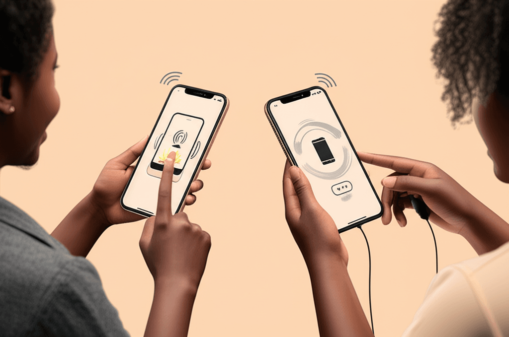
Decoding WCAG for Mobile: The Four POUR Principles
I once watched a friend, frustrated, give up on ordering a coffee through an app. He was trying to use his phone one-handed while holding a briefcase, and the tiny, un-resizable text combined with finicky swipe-only gestures made it impossible. This brings us to something often overlooked in the rush to ship features: the foundational structure for digital accessibility. The Web Content Accessibility Guidelines (WCAG) are not just a checklist; they’re a philosophy built on four pillars, easily remembered by the acronym POUR.
Perceivable
This is about information presentation. Can users perceive all the content you’re showing them? Think about a user with low vision trying to read light grey text on a white background. We must provide text alternatives for images and icons, ensure our color contrast meets at least the WCAG AA standard of 4.5:1, and support text resizing through system settings like iOS’s Dynamic Type.
Operable
An app is operable if everyone can use its interactive elements. For mobile, this means more than just touch. Every function available via a swipe should also be accessible to someone using a screen reader like VoiceOver or an external keyboard. For instance, a swipe-to-delete action in a list must have an alternative button that a switch control user can activate. Large tap targets are a simple but effective part of this.
Understandable
Clarity is key. Is the information and the operation of the user interface easy to comprehend? This means using plain language, providing clear instructions, and designing predictable navigation. When a user taps a button, the result should be what they expect. Error messages should explain what went wrong and how to fix it, not just display an error code.
Robust
The final principle is about compatibility. Your app must be built with clean code so that a wide range of technologies, especially assistive ones, can interpret it correctly. When you use standard platform components, you inherit a great deal of this reliability. Custom controls, however, require careful implementation to ensure they communicate their state and purpose to screen readers now and after the next OS update.
Inclusive Design in Practice: Beyond the Checklist
I once sat in a review where a team proudly showed off their perfect score from an automated accessibility checker. Every alt tag was present, every contrast ratio met the minimum. Yet, when we handed the app to a blind user, he couldn’t complete the checkout process. The “accessible” components were technically compliant but logically out of order for a screen reader, creating a frustrating dead end. The team had passed the test but failed the person.
Here’s what really matters though. True accessibility isn’t about clearing a series of technical hurdles just before launch. It’s a philosophy you build into your process from the very first sketch, rooted in fundamental UX principles: clear layouts, legible typography, and predictable navigation.
Thinking in Spectrums, Not Categories
A powerful mental model is Microsoft’s Persona Spectrum. This framework encourages us to think beyond permanent disabilities. Someone with one arm (permanent) has similar needs to someone with a broken arm (temporary) or a new parent holding a baby (situational). When you design a one-handed-friendly interface for the first person, you’ve automatically created a better experience for the other two. You solve for one, but extend the benefit to many.
Co-designing with Real People
The single most effective practice I’ve seen is involving people with disabilities in the design room, not just the testing lab. In one project, we co-designed a navigation menu with a user who has a motor tremor. His feedback led us to increase tap target sizes and add more space between items—a change that also dramatically reduced accidental taps for all our users. These insights don’t come from a checklist; they come from shared experience. It shifts your perspective from designing for them to designing with them.
Technical Implementation: Key Code for Accessibility
I once watched a friend, who relies on a screen reader, try to order a pizza. He tapped the screen, and the app’s voice cheerfully announced, “Button. Image 84B.” He sighed and tried again. “Button. Image 84C.” We never figured out which button added pepperoni. That moment wasn’t about a bug; it was about a conversation that failed before it even started. The app was speaking a language of file names, not features.
But here’s where it gets interesting. Preventing that frustration often comes down to just a few lines of code and a shift in perspective. It’s about giving our UI elements a clear voice and a predictable structure.
Screen Reader Support
That pizza button’s failure was a missing label. For iOS, you provide a clear, human-readable string to the accessibilityLabel property. On Android, it’s the contentDescription attribute. Instead of “Image 84B,” it should say, “Add pepperoni to pizza.” Suddenly, the button isn’t a mystery; it’s an action.
Dynamic Type and Font Scaling
When users increase their system font size, your interface shouldn’t shatter. By using dynamic type with UIFont.preferredFont in UIKit or embracing scalable pixels (sp) in Android, you allow your text to reflow gracefully. This ensures readability without forcing users to pinch and zoom constantly.
Touch Target Sizing
Every interactive element needs to be easily tappable. The WCAG guidelines suggest a minimum size, which translates to 44×44 points on iOS and 48x48dp on Android. This simple rule dramatically improves usability for people with motor impairments and, frankly, for anyone trying to use an app on a bumpy bus ride.
Managing Focus Order
For someone navigating sequentially, the focus order is the story of your screen. It should move logically from top to bottom, left to right. If your checkout flow jumps from the email field to the navigation bar before the “Next” button, you’ve created a confusing maze. You can guide this path programmatically to ensure a coherent user journey.
Testing and Auditing for True Accessibility
I once worked on an app where our automated scans came back clean. We had green checkmarks across the board and felt pretty good about our work. Then, during a final check, I turned on the screen reader myself. The prominent “Complete Purchase” button at the end of our checkout flow was announced simply as “Button.” That’s it. A total showstopper for a blind user, yet completely invisible to our automated tools. It was a sharp reminder that compliance on paper doesn’t always equal a usable experience.
Automated Scanning: The First Pass
Think of automated tools as your first line of defense. Integrating Google’s Accessibility Scanner on Android or using Xcode’s Accessibility Inspector on iOS will quickly catch the low-hanging fruit. These scanners are brilliant at flagging issues like insufficient color contrast, small touch targets, and some missing content labels. They give you a quick, actionable checklist to fix the most common machine-detectable problems before you get too far down the road.
Manual Testing: Becoming the User
After the machines do their part, it’s time for you to step in. This is about simulating the user experience, and it’s where you’ll find the issues that automated tools miss. Here’s a simple checklist I follow:
Screen Reader Test: Activate VoiceOver (iOS) or TalkBack (Android). Without looking at the screen, try to complete a core task. Is the information presented in a logical order? Are all controls properly labeled?
Keyboard Navigation: Connect a Bluetooth keyboard and navigate your app using only the Tab and Enter keys. This is essential not just for keyboard users but also for people who use switch control devices. Check for a visible focus indicator and ensure there are no “keyboard traps” where you can’t navigate away from an element.
Dynamic Text: Go into the device settings and increase the font size to its maximum. Does your UI break, or does the text reflow elegantly?
User Testing: From Compliant to Usable
The most meaningful insights, however, come from real people. Automated and manual checks can confirm your app is technically accessible, but they can’t tell you if it’s actually usable. Partner with organizations or testing services to get your app in front of people with various disabilities. Their feedback is invaluable. They’ll point out confusing workflows or frustrating interactions that you, as a sighted developer, would never notice. This is how you move beyond a simple checklist and build something that is truly inclusive.
More Than a Welcome Mat
I once watched my grandfather, a man who loves keeping up with the news, give up on a popular app. The buttons were too small, the text impossible to resize. He just sighed and put his phone down. That moment wasn’t about a technical failure; it was a human one. Building for accessibility isn’t about checking off compliance boxes. It’s about infusing empathy into every line of code and every design choice, transforming a set of rules into a genuine invitation for everyone to participate.
The first step is often the simplest: looking at your own app through a new lens. Start your accessibility audit today. Download our free mobile accessibility checklist to begin building an app that truly welcomes everyone.
Frequently Asked Questions
What is the difference between accessibility and inclusive design?
Accessibility is the outcome: making a product usable by people with disabilities. Inclusive design is the process: designing a product to be usable by the widest possible range of people, considering diversity in ability, language, culture, and other factors. Inclusive design leads to accessibility.
What WCAG level should mobile apps aim for?
WCAG 2.1 Level AA is the generally accepted standard and legal requirement for most mobile applications. It provides a strong level of accessibility without being overly restrictive, making it a practical and effective target for most development teams.
How do I start testing my mobile app for accessibility?
Start with manual testing. Turn on your phone's screen reader (VoiceOver on iOS, TalkBack on Android) and try to navigate your app without looking at the screen. This simple test will quickly reveal major navigation and labeling issues.