Picture this: You land on a new website. Your screen is immediately flooded with competing pop-ups, a dozen menu items, and three different calls-to-action. You don’t know where to look first, so you look nowhere. You hit the back button.
There’s a persistent myth that minimalist design is boring design—that it means barren, lifeless pages with no personality. This is a fundamental misunderstanding of the principle. True minimalism isn’t about stripping elements away until nothing is left; it’s about deliberate reduction to amplify what truly matters. It’s about surgically reducing the cognitive load on your user to create a crystal-clear visual hierarchy, an approach rooted in the “less, but better” philosophy.
This isn’t about choosing between simplicity and impact. It’s about achieving both. We’ll show you exactly how to pair vast negative space with powerful, full-bleed imagery and sharp typography. You will learn the practical techniques to create a design that feels both clean and unforgettably bold, guiding your user’s attention precisely where you want it to go.
The Core Philosophy of Minimalist Web Design: Less is More
There’s a persistent myth that minimalist web design is simply an aesthetic trend—a look defined by what it lacks. Many see vast fields of white, sparse text, and think “boring” or “empty.” After years of designing and analyzing user behavior, I can tell you this view misses the point entirely. True minimalism is not about subtraction for its own sake; it’s a disciplined, function-first philosophy where every single element serves a purpose. It’s about intention.
More Than Just Empty Space
The most misunderstood tool in the minimalist kit is negative space. It isn’t a void to be filled; it is an active component that directs the human eye. Proper use of negative space creates a natural visual hierarchy, drawing a user’s attention directly to what matters most: the call-to-action, the key message, or the one field they need to complete. Think of it less as an empty background and more as a spotlight, intentionally isolating and elevating the essential components of your interface.
Reducing Friction for the User
Every element you add to a page—an image, a button, a line of text—increases the user’s cognitive load. This is the mental effort required to process information. A cluttered interface forces the brain to work harder, creating friction and decision fatigue. Minimalism is the antidote. By presenting a limited, focused set of options, you respect the user’s mental bandwidth and make their journey effortless. For instance, consider a product page. A page crowded with social sharing buttons, pop-ups for newsletters, and a carousel of “related items” all compete with the primary goal: the Add to Cart button. A minimalist approach removes that noise, making the desired action obvious and easy. This isn’t just theory; it’s a practical application of Hick’s Law, which confirms that decision time increases with the number of choices. Simplicity doesn’t just look clean; it performs better because it gets out of the user’s way.
Creating Maximum Impact: The Power of Bold Visuals
There’s a persistent myth that minimalist design must be timid. Many designers, in their quest for simplicity, strip away not just clutter but also personality, leaving behind a sea of white space, grey text, and predictable layouts. They achieve clean, but they often sacrifice impact. But here’s where it gets interesting. True minimalism isn’t about absence; it’s about amplifying the presence of what remains. It creates a stage for a few powerful elements to truly command attention.
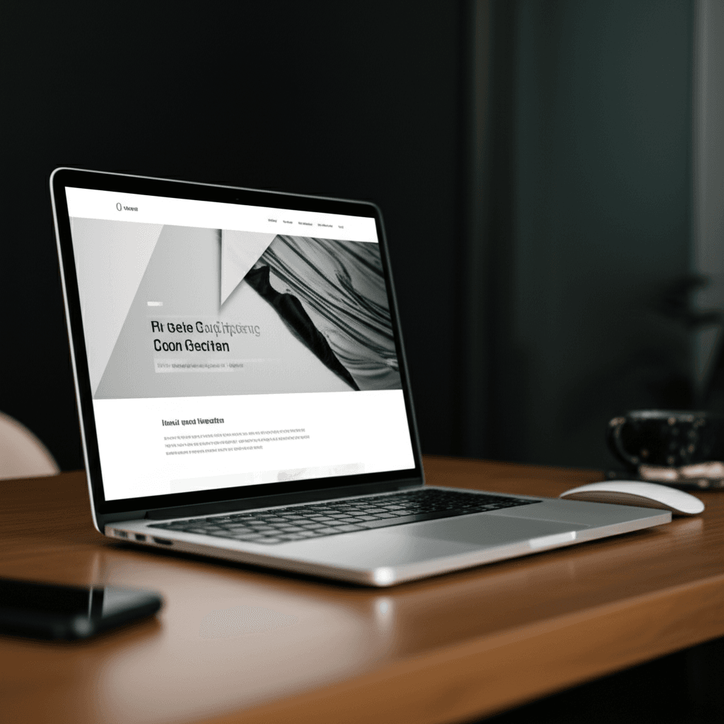
The Singular, Striking Image
Instead of a carousel of mediocre photos, a minimalist framework calls for one exceptional visual. This could be a full-screen hero image or a background video that communicates your entire brand ethos in seconds. Consider a portfolio for a commercial photographer. A grid of thumbnails feels busy. A single, stunning, full-bleed shot of their best work, however, makes an immediate and confident statement. The key is that the image must do more than just look good—it must have a clear focal point that directs the user’s eye toward the primary call-to-action. It has a job to do.
When Type Becomes the Art
In a space with fewer distractions, typography is elevated from simple text to a primary graphic element. You can create immense visual interest by pairing a bold, expressive display font for your main heading (think a strong slab serif or a geometric sans-serif) with a clean, highly legible font for body copy. The contrast itself creates hierarchy and personality. The words are not just content; they are a core part of the aesthetic. This deliberate choice turns a headline into a logomark and a paragraph into a stable, structural block.
A Focused and Emotional Color Palette
Maximum impact rarely comes from using every color in the box. A minimalist approach uses color with intention. A common and effective practice is a variation of the 60-30-10 rule: 60% for a primary neutral color, 30% for a secondary supporting color, and a potent 10% for a single accent. This accent color—a vibrant ochre, an electric blue, a deep magenta—is used sparingly and strategically for buttons, links, and key highlights. It trains the user’s eye, making the path to conversion feel both intuitive and visually satisfying.
Striking the Perfect Balance: How Simplicity and Boldness Work Together
Many designers treat minimalism as a destination of absence—a constant process of removal. They believe adding a bold, attention-grabbing element somehow betrays the principle. But wait — there’s more to consider. The conventional wisdom that simplicity and boldness are opposing forces is a fundamental misunderstanding of how visual attention works. True minimalism isn’t about being empty; it’s about making what remains matter more. Boldness doesn’t fight simplicity; it thrives in it.
Establish a Clear Hierarchy
The entire partnership hinges on creating an undeniable visual hierarchy. Your goal is to direct the user’s eye with absolute intention. This is where I apply the ‘one-big-thing’ rule: for any given screen view, choose one element to be the undisputed star. This could be an oversized typographic headline, a single vivid product photograph against a neutral background, or a shocking block of color. Everything else on the screen then becomes the supporting cast, existing only to give that hero element context and breathing room. When you give a user too many bold things to look at, you’ve given them nothing to focus on. But when you present one powerful focal point, you create clarity and immediate impact.
Use Grids Strategically
A structured grid is your best friend for achieving this balance. A predictable layout provides the ‘simple’ foundation, which makes a ‘bold’ deviation feel intentional and exciting. For example, imagine you’re working with a standard 12-column grid. You could place your body copy and navigation neatly within this structure. Then, you let your hero image span an unconventional 9 columns, leaving 3 columns of pure negative space. This asymmetry feels deliberate and dynamic. The image feels bolder precisely because it breaks the pattern the rest of the page follows. The grid provides the rules so your one big, bold move can effectively break them.
Beyond Aesthetics: How Minimalism Enhances User Experience (UX)
Now, you might be wondering if minimalism is just a visual trend—a preference for white space and stark typography. That’s a common misconception. For over a decade, I’ve seen teams treat minimalism as a coat of paint, applying a “clean” look without understanding the functional engine beneath it. True minimalist design is not about what’s missing; it’s about making every single element that remains work harder and smarter for the user.
Performance Is a Feature
The most immediate UX benefit of a minimalist approach is speed. A design with fewer elements—fewer high-resolution hero images, complex scripts, and third-party plugins—results in a lighter page weight. This isn’t just a technical detail. It directly impacts user retention because a faster site feels more responsive and professional. When you intentionally limit your design components, you are essentially building within a performance budget, ensuring the experience is quick and fluid, especially on mobile networks where every kilobyte counts.
Clarity Over Clutter
Minimalism drastically reduces cognitive load. When a user lands on a page crowded with competing buttons, banners, and text blocks, they experience decision paralysis. By embracing negative space and a clear visual hierarchy, you guide the user’s eye. Consider the classic e-commerce product page. A minimalist design removes sidebar promotions and distracting pop-ups, focusing attention squarely on the product images, description, and the Add to Cart button. This creates an intuitive, frictionless path from discovery to action, which often translates directly to higher conversion rates.
Inclusive and Accessible by Design
A surprising benefit of this focused approach is improved accessibility. Generous spacing, large, legible fonts, and high-contrast color schemes are hallmarks of good minimalist design. These choices also happen to align perfectly with Web Content Accessibility Guidelines (WCAG). A clean layout is far easier for users with screen readers to interpret and for individuals with cognitive disabilities to process. By removing visual noise, you make your website more usable for everyone, not just a select audience.
Your Action Plan: Implementing Minimalist Design with Bold Visuals
Let’s clear up a common myth. Minimalism isn’t about having less; it’s about making what you have mean more. The goal isn’t an empty page, but a focused one. This approach demands discipline, but the payoff is clarity and impact. Here’s a four-step plan to get it right.
Step 1: Practice Ruthless Subtraction
Before you add anything bold, you must first remove the noise. Conduct a content audit with a simple, unforgiving rule: if an element—a button, a link, a paragraph of text—doesn’t directly support the primary goal of the page, it has to go. This isn’t just tidying up; it’s a content-first design philosophy. Every word and pixel must justify its existence. Be honest with yourself. Does that social media feed actually convert, or is it just a distraction?
Step 2: Anoint Your Visual Hero
Now that you have a clean canvas, define your single, dominant visual. This is the centerpiece of your design. It could be a striking product photograph against a plain background, an abstract 3D render, or even a piece of oversized, expressive typography. The key is that it’s one thing. Look at how early Dropbox homepages used a simple, charming illustration to explain a complex service. That single visual did all the heavy lifting, making the technology feel accessible and friendly.
Step 3: Choose Your Uniform
Resist the temptation of a sprawling color palette. Stick to a highly constrained system. A common and effective method is to use a dominant neutral (like off-white or dark gray), a single secondary color for subtle support, and one high-contrast accent color reserved exclusively for calls-to-action. For typography, start with one versatile font family. A workhorse sans-serif like Inter can handle everything from bold headlines to readable body copy, ensuring consistency without complexity.
Step 4: Architect the Emptiness
Many designers see white space as the background. Experienced designers see it as an active tool. When wireframing your layout, treat the space around your elements with as much intention as the elements themselves. Ample spacing creates breathing room, guides the user’s eye, and establishes a clear visual hierarchy. Try this: place your headline, your hero visual, and your main button on the page. Now, double the distance between them. Notice how each element gains importance? That’s the power of negative space at work.
Simplicity is a Superpower
There’s a persistent myth that minimalist design is a safe, even boring, choice. The truth is the opposite: it is a deliberate act of courage. Effective minimalism isn’t about what you remove, but what you intentionally amplify. By stripping away distractions, you create a focused stage where bold visuals and a core message can perform, guiding users without friction. This approach proves that clarity and impact are not mutually exclusive; they are powerful partners. Ready to transform your website? Start by auditing your content and discover how simplicity can create your biggest impact yet.
Frequently Asked Questions
What is minimalist web design?
It's a design philosophy that focuses on simplicity, using only essential elements to create a clean, uncluttered, and user-friendly interface. It emphasizes negative space, bold typography, and a clear visual hierarchy.
Is minimalist web design good for SEO?
Yes, it can be excellent for SEO. Minimalist sites often have faster load times, improved mobile-friendliness, and a better user experience, all of which are positive ranking factors for search engines.
How do I make my minimalist website look bold and not boring?
To avoid a boring design, focus on high-impact elements. Use a single, stunning hero image or video, employ oversized and unique typography as a graphic element, and choose a limited but powerful color palette to create visual interest and guide the user's eye.