Redesign Sri Lanka Tourism Websites: Boost Bookings
I’ve probably scrolled through a hundred Sri Lankan hotel websites this year, especially for properties in the Gampaha district and down the coast. So many are filled with stunning photos, but I think they often miss the most important step. You have this amazing, bookable experience, yet the website itself creates friction that stops a visitor right before they commit. It’s a classic case of great visuals but a weak booking funnel. How many people have you lost on a confusing calendar page?
Honestly, a redesign isn’t just about a fresh coat of paint. It’s about understanding the psychology of a traveller and building a clear, persuasive path from their first impression to the final confirmation email. Your website has one primary job: to turn a curious visitor into a confirmed guest. It needs to work for your business, not just sit there looking pretty.
So, forget the abstract theory. I’m going to walk you through some specific, actionable design principles that directly influence a visitor’s decision to click ‘Book Now’. We’ll cover how to build instant trust, simplify your booking flow until it’s effortless, and make your photos do the selling for you. This is about getting you more direct bookings.
The High Cost of an Outdated Website in Gampaha’s Tourism Sector
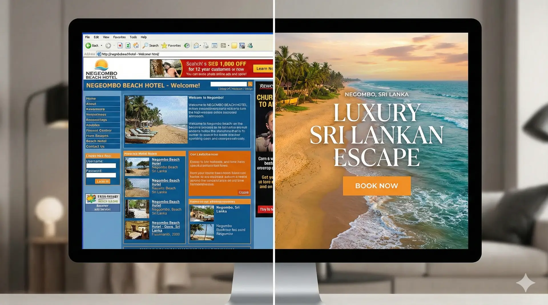
Look, I get it. You built your website years ago, it has some nice pictures, and it technically “works.” But I think we need to be honest with ourselves about what that old site is actually costing your business. It’s not just about looking a bit dated; it’s about actively losing money and turning away the very customers you’re trying to attract to your beautiful spot in Negombo or along the coast.
Your Digital First Impression
Think about it. When a potential guest lands on your site, that’s their first real interaction with your brand. Studies have shown that 94% of first impressions are design-related. If your site looks like it was built in 2010—with a cluttered layout, low-resolution photos, and old-fashioned fonts—what message does that send? It suggests the business might be just as neglected. It creates an immediate sense of distrust, especially for an international tourist who is about to enter their credit card details. A missing security certificate (that little padlock in the browser bar) is an absolute deal-breaker for direct bookings.
The Mobile Booking Nightmare
Here’s a quick scenario. A traveller from Germany is on the train, planning her trip to Sri Lanka on her smartphone. She searches for a boutique hotel near the beach. She finds your site, but it’s not mobile-friendly. She has to pinch, zoom, and scroll sideways just to read a sentence. The booking button is tiny and impossible to tap. What does she do? She hits the back button and books with your competitor down the road whose site just works on her phone. You’ve lost a direct, commission-free booking simply because your website wasn’t designed for the device nearly everyone uses to plan travel.
Invisible on Google
Maybe the biggest hidden cost is simply not being found at all. Search engine optimization (SEO) isn’t a one-time thing. The rules change constantly. Old websites are often built on code that Google struggles to understand, and they lack the structure needed to rank for valuable search terms. So, when someone searches for “best seafood restaurant in Negombo” or “family-friendly hotel Gampaha,” your outdated site is buried on page five or six. It’s like having a beautiful hotel with no road leading to it. Can you really afford to be invisible to your ideal customer?
Pillars of Modern Web Design for Sri Lankan Tourism
This brings us to something often overlooked in web design in sri lanka. Many hotel and tour operators in the Gampaha district think a website is just a digital brochure—a place to list rooms and prices. But I think a modern website is your most powerful salesperson, working 24/7 to convince and convert visitors. It’s not about having a presence; it’s about having a purpose. To get there, you need to build your site on a few solid pillars.
Visuals That Tell a Story, Not Just Show a Room
Let’s be honest, the generic, perfectly made bed photo isn’t what sells a Sri Lankan coastal holiday. Your guests are dreaming of an experience. You need to show them what that feels like. Instead of stock photos, use high-resolution, professional images and short videos of real moments: a fisherman casting his net in the Negombo Lagoon at dawn, the vibrant chaos of the local fish market, or the genuine smile of your staff offering a guest a king coconut. You are selling the smell of the salt spray and the warmth of the sun, not just a place to sleep.
A Flawless Mobile-First Experience
Notice I said “mobile-first,” not just “mobile-friendly.” The distinction matters. Most of your potential customers are scrolling on their phones while commuting or on a lunch break. Your website must be designed for their thumbs first. This means text is easy to read, buttons are large enough to tap, and the entire experience is fluid on a small screen. Google also prioritizes mobile-first sites in its search rankings, so this isn’t just about user convenience; it’s about being found in the first place.
An Effortless Path to Booking
A confused user will not book. Your website’s main job is to guide visitors from interest to action with zero friction. I’ve seen so many sites where the booking button is buried or the calendar is clumsy to use. The goal is clarity. A visitor should be able to figure out the following in seconds:
What you offer (e.g., boutique hotel, surf camp, lagoon tour).
Why it’s special (your unique selling point).
How to book or contact you.
If someone can’t find your “Book Now” button in under three seconds, you have a design problem.
Speed is a Feature, Not an Afterthought
This might be the most important pillar of all. A slow website kills conversions. Every second a visitor waits for your page to load, their interest drops. It has to be fast. We’re talking under three seconds. This is especially true for tourists who might be accessing your site on less-than-perfect mobile networks. Optimizing your images and using modern development techniques makes a massive difference. After all, what good is a beautiful photo if it takes ten seconds to load?
Essential Features to Convert Visitors into Bookings
Here’s the part most people miss. A beautiful website is just a pretty brochure if it doesn’t actively turn a casual visitor into a paying guest. It’s not about adding more bells and whistles; it’s about strategically including features that build trust and make booking an absolute no-brainer. I think of it as building a direct, profitable path from their first click to their final confirmation.
An Integrated, Commission-Free Booking Engine
First things first, you need your own booking engine built directly into your website. I’m talking about a system where a guest can see real-time availability, select their dates, and pay securely without ever leaving your site. Sending them to a third-party platform feels clunky and can lose you the sale. By keeping it in-house, you not only provide a smoother experience but you also stop paying those hefty commissions to online travel agents. That money goes straight into your pocket, where it belongs.
Social Proof and Signals of Trust
People book with businesses they trust. You can build this trust instantly by showing off your reputation. Instead of just saying you have great reviews, use a widget to display your latest TripAdvisor or Google reviews directly on your site. Seeing recent, positive feedback from real people is incredibly persuasive. Also, don’t forget the small stuff. Placing secure payment logos like Visa and Mastercard near your booking buttons is a small visual cue that tells visitors their transaction is safe. It’s about making them feel comfortable handing over their details.
Hyper-Local Content That Attracts Searchers
This is a smart SEO move I’ve seen work wonders. Think about what your guests are searching for before they look for a hotel. Maybe it’s “best time to visit Muthurajawela Marsh” or “day trips from Negombo.” Create dedicated pages or blog posts on your site answering these questions. For example, a detailed guide to a local temple not only provides genuine value but also captures search traffic. When they find your helpful article, your hotel becomes the obvious and convenient place to stay for that experience.
Clear, Unmistakable Calls-to-Action (CTAs)
You have to tell people exactly what you want them to do next. After all, what good is a beautiful room gallery if there isn’t a button right there that says ‘Book Your Stay’? These CTAs should be everywhere they make sense: in your header, after room descriptions, and on your tour pages. Use compelling, action-oriented text like ‘Check Availability & Rates’ or ‘Explore Our Packages’. Make the buttons a contrasting color so they stand out. It’s a simple change that makes a massive difference in directing user flow toward a booking.
Case Study: A Negombo Hotel’s Digital Transformation
I’ve seen this story play out so many times over the years. Let’s talk about a fictional but totally realistic example I’ll call ‘Lagoon View Inn’, a charming 20-room hotel in Negombo. Their website was, to put it kindly, a relic. Built over a decade ago, it looked okay on a big desktop screen but was a complete disaster on a smartphone. You had to pinch, zoom, and scroll endlessly just to find the booking button. Their analytics confirmed the problem: a mobile bounce rate of over 85%. People were landing on the site and leaving almost immediately. As a result, they were almost completely dependent on Online Travel Agencies (OTAs), which were happily taking a 15-20% commission on nearly every booking.
The Strategy: More Than Just a Pretty Picture
I think the smartest thing the owners did was to approach the redesign with a clear business strategy, not just a wish for a “modern look.” We focused on three key areas. First, they finally invested in professional photography. No more grainy phone pictures. We got incredible shots of the lagoon at sunset, the pool area, and the delicious-looking Sri Lankan breakfast they served. Second, the entire design process followed a mobile-first philosophy. This means we designed the experience for the smallest phone screen first and then adapted it for tablets and desktops. It’s a non-negotiable approach today. Finally, and most importantly, we integrated a simple, secure direct booking engine right into the site and focused our SEO efforts on a very specific phrase: ‘family hotel Negombo’. Why? Because their best rooms were family suites. They decided to own their niche instead of fighting the big players for broader terms.
The ‘After’: Tangible, Bankable Results
The change wasn’t just aesthetic; it directly impacted their bottom line. The results after just six months were fantastic and proved the value of the investment:
Mobile traffic saw a 70% increase, but this time, visitors were actually staying and exploring the site.
Direct bookings, made straight through their new website, shot up by 40%. That’s a massive amount of revenue that went directly to them, bypassing OTA commissions.
Within that period, they ranked in the top 3 on Google for their target keyword, ‘family hotel Negombo,’ attracting a steady flow of their ideal guests.
This success wasn’t magic. It was the direct result of understanding their guest and building a digital storefront that served them properly. Lagoon View Inn shows how any tourism business along the coast can achieve similar results by investing in a user-centric design and a clear digital strategy.
So, What’s the Bottom Line?
I think it all just boils down to this: your website isn’t just a digital brochure for your Gampaha hotel or coastal tour. It’s your hardest-working salesperson, selling the Sri Lankan dream 24/7. When a potential guest lands on your page, do they instantly feel the sea breeze and trust you enough to click “book now”? That’s the real goal. It’s about turning a casual browser into a confirmed guest by making them feel that an amazing experience is just one click away.
Ready to transform your Gampaha or coastal tourism website and capture more direct bookings? Contact us for a free design consultation today. Imagine your booking calendar filling up, not with commission-heavy platform bookings, but with excited travelers who found and fell in love with you directly online.
Frequently Asked Questions
How much does a tourism website redesign cost in Sri Lanka?
The cost varies widely based on complexity, features like a booking engine, and the design agency. A basic redesign can start from LKR 150,000, while more complex projects for larger hotels or tour operators can be significantly higher. It’s best to get a custom quote.
How long does it take to redesign a hotel website?
A typical redesign project for a small to medium-sized hotel in Sri Lanka takes between 6 to 12 weeks, from initial strategy and design mockups to development, content integration, and final launch.
What is the most important feature for a modern tourism website?
While high-quality visuals and mobile responsiveness are crucial, the most important feature for driving revenue is a seamless, secure, and easy-to-use direct booking engine. It empowers customers to book instantly and saves you from paying high commissions to third-party sites.