Web Design Colombo: Mobile-First for 85% Smartphone Users in Sri Lanka
The Mobile Tsunami: Why 85% Smartphone Usage Changes Everything for Colombo Businesses
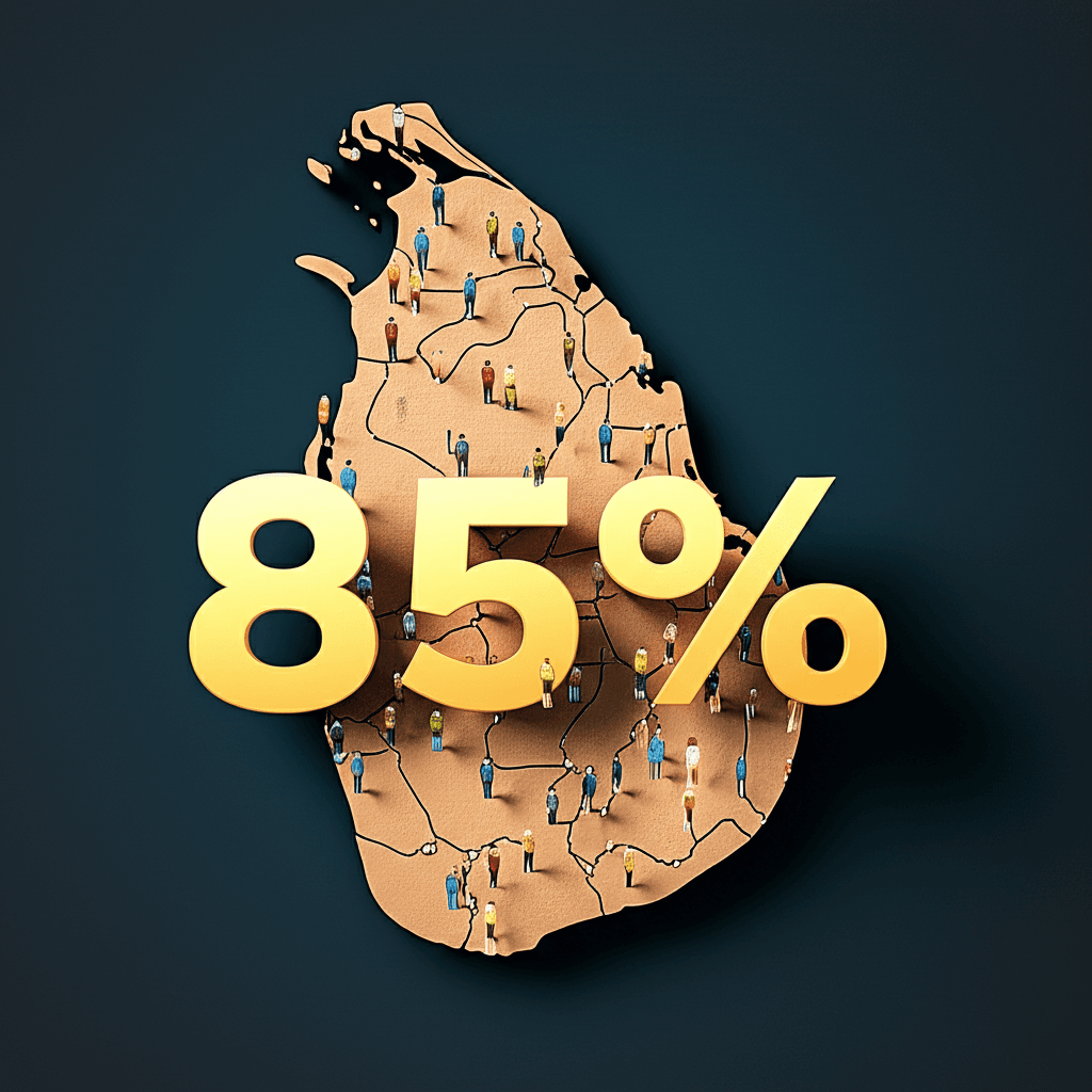
Think about your customers right now. Where are they? It is very likely they are holding a smartphone. In Sri Lanka, an incredible 85% of internet users connect through their mobile devices. This is not just a passing trend. It is a fundamental shift in how people find information, shop for products, and connect with businesses.
For any company in Colombo, from a local restaurant to a growing retail brand, this number is a game-changer. Your website is your digital storefront, and most visitors are now arriving on a small screen. If your site is slow to load, has tiny text, or uses buttons that are hard to press, potential customers will not wait. They will simply leave and find a competitor whose website offers a smooth mobile experience.
This is why a “mobile-first” approach is no longer optional. It means designing your website for the phone first, then adapting it for larger screens like desktops. This ensures a fast, clean, and user-friendly experience for the majority of your audience. Focusing on quick load times is critical to keeping mobile users engaged. A fast, mobile-friendly website is essential for survival and growth in today’s digital landscape. Ensuring your site is built for performance, through methods like optimizing Core Web Vitals, will help you capture this massive mobile audience.
Mobile-First vs. Responsive: A Crucial Distinction for Optimal User Experience
When we talk about websites that work on any device, two terms often appear: responsive and mobile-first. While they sound similar, they are very different approaches. Understanding this difference is key to creating a great experience for users in Sri Lanka.
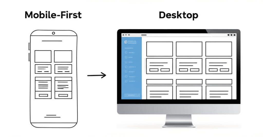
Responsive design traditionally starts with a full-featured desktop website. This large design is then adjusted, or “responds,” to fit smaller screens like tablets and smartphones. Think of it as shrinking a big picture to fit a small frame. Some elements might be hidden or rearranged to make it work.
Mobile-first design flips this idea. It starts by designing for the smallest screen: the mobile phone. The focus is on the most essential content and features that users need on the go. From this simple, clean foundation, the design expands to add more features for tablets and desktops. It prioritizes the mobile user from the very beginning.
In a market like Sri Lanka, where most people use smartphones to access the internet, this distinction is vital. A mobile-first approach ensures your website is fast, clean, and easy to use on the device your customers prefer. It improves performance, which is a key part of [optimizing Core Web Vitals](https://www.joomlasrilanka.com/web-design/optimizing-core-web-vitals-for-high-performance-wordpress-sites-serving-sri-lankan-tourism-businesses/), and results in a better overall user experience. This focus on the mobile user is one of the most important [web design trends for Sri Lankan businesses](https://www.joomlasrilanka.com/blog/15-web-design-trends-that-will-transform-sri-lankan-businesses-in-2025/) today. It isn’t just about making a site fit; it’s about making it work perfectly for the majority of your audience.
The Tangible Benefits: How Mobile-First Drives SEO and Sales in Colombo
Adopting a mobile-first design is more than just a modern trend. For businesses in Colombo, it is a direct strategy for growth. This approach brings real, measurable benefits that boost your online visibility and increase your sales. When the vast majority of your customers are on smartphones, meeting them where they are is crucial for success.
First, let’s look at search engine optimization (SEO). Google now uses “mobile-first indexing,” which means it primarily uses the mobile version of your website to rank it in search results. If your site is slow or hard to use on a phone, your ranking will suffer. A well-designed mobile site provides a better user experience, which tells Google that your site is valuable. This also improves key performance metrics like Core Web Vitals, which are essential for ranking high today.
Better SEO brings more visitors, and a great mobile experience turns those visitors into buyers. When a potential customer finds your e-commerce store on their phone, they expect a smooth and simple process. A mobile-first design makes products easy to view, buttons easy to tap, and checkout quick. This seamless journey reduces cart abandonment and leads to more completed sales. Ultimately, a professional mobile presence builds trust and makes it easier to retain customers in Sri Lanka’s booming e-commerce market.
Choosing Your Colombo Web Design Partner for a Mobile-First Future
Picking the right web design partner in Colombo is key to your success. With most of your customers on smartphones, you need a team that truly understands mobile-first design. This is more than just making a website that shrinks to fit a small screen. It’s about creating an experience built for the mobile user from the very beginning. A great partner will focus on clean layouts, easy navigation with a thumb, and fast load times.
So, what should you look for? First, ask to see their portfolio of mobile-friendly websites. A good partner will be proud to show you their work. They should have strong technical skills and a deep understanding of how to make your site fast. Fast-loading pages are crucial for mobile users, so ask about their experience with optimizing Core Web Vitals to keep visitors engaged.
Your partner should also know how to build a website that can grow with your business. A flexible platform like WordPress is often a great choice for this. Look for an agency experienced in building scalable WordPress portals that can handle more traffic and features as you expand. Finally, choose a team that understands the Sri Lankan market and can offer ongoing support to keep your site modern, secure, and running smoothly.
{“@context”:”https://schema.org”,”@type”:”FAQPage”,”mainEntity”:[{“@type”:”Question”,”name”:”Why is mobile-first web design so important in Sri Lanka?”,”acceptedAnswer”:{“@type”:”Answer”,”text”:”With over 85% of Sri Lanka’s internet users on smartphones, a mobile-first approach ensures your website is optimized for the vast majority of your potential customers. It improves user experience, boosts SEO rankings with Google’s mobile-first index, and increases conversion rates.”}},{“@type”:”Question”,”name”:”Is ‘mobile-first’ the same as ‘mobile-friendly’ or ‘responsive’?”,”acceptedAnswer”:{“@type”:”Answer”,”text”:”Not exactly. While a responsive site works on all devices, a ‘mobile-first’ design prioritizes the mobile experience from the very beginning of the design and development process. This results in a faster, more intuitive site for mobile users, rather than simply adapting a desktop design for a smaller screen.”}},{“@type”:”Question”,”name”:”How can a mobile-first website help my business in Colombo?”,”acceptedAnswer”:{“@type”:”Answer”,”text”:”A mobile-first website makes you more visible to local customers searching on their phones, provides a better user experience that can lead to more sales and leads, and gives you a significant advantage over local competitors with slow or poorly designed mobile sites. [[Link to our Portfolio]] to see examples.”}}]}


