Web Design Colombo: Mobile-First for 85% Smartphone Users in Sri Lanka
The Mobile Revolution in Sri Lanka: Why 85% is a Game-Changer for Colombo Businesses
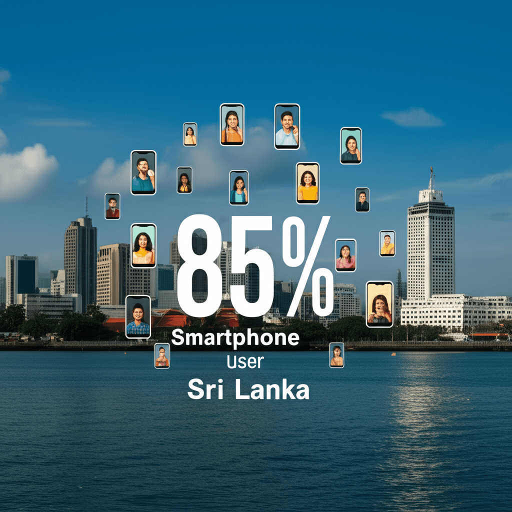
In Sri Lanka, the internet is no longer something you access on a desktop computer. Today, a massive 85% of people use their smartphones to go online. This simple fact has completely changed the game for businesses in Colombo and across the island. Your customers are not sitting at a desk; they are on the move, using their phones to find, research, and connect with you.
Think about what this means for your website. If a potential customer visits your site on their phone and has to pinch and zoom just to read your text, they will leave. If your pages take too long to load on a mobile connection, they will go to a competitor. A positive mobile experience is now essential. This is why factors like site speed and performance are critical for keeping users engaged. Great performance ensures your website is fast and responsive, which is a key part of optimizing your Core Web Vitals for a modern audience.
This mobile-first reality is a huge opportunity. A website designed for phones puts your business directly into the hands of your customers, 24/7. It allows you to make everything easier for them, from booking an appointment to making a purchase. For e-commerce businesses, offering simple and trusted payment methods is vital. Integrating localized payments popular in Sri Lanka can significantly increase sales by making the checkout process seamless for mobile shoppers. For any Colombo business, ignoring the mobile audience is no longer an option—it’s the key to growth.
Decoding Mobile-First Design: More Than Just ‘Mobile-Friendly’
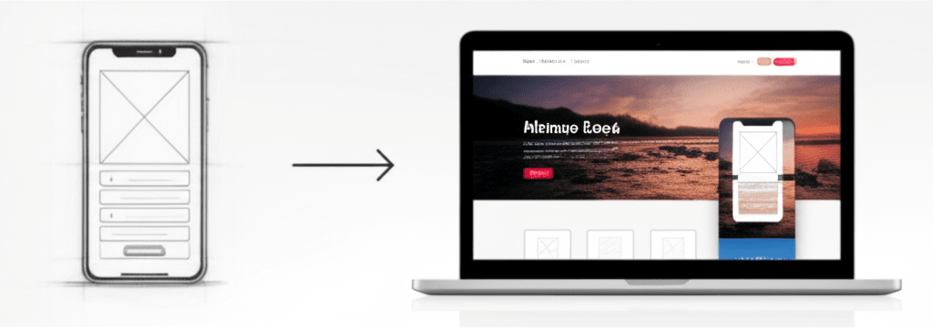
You may have heard the terms “mobile-friendly” and “mobile-first” used together. While they sound similar, they describe two very different approaches to web design. For a long time, the goal was to make a website “mobile-friendly.” This meant building a site for a desktop computer and then adjusting it to shrink down and fit on a phone screen. This is also known as responsive design. However, this often leads to a slow or clumsy experience on a phone, with tiny text and hard-to-tap buttons.
Mobile-first design completely flips this process. Instead of starting with a large screen, designers begin with the smallest screen: the smartphone. The core focus is on delivering the most essential content and features in a clean, fast-loading, and easy-to-use format for mobile users. Buttons are made large enough for thumbs, and navigation is kept simple. Only after the mobile experience is perfected is the design expanded for larger tablet and desktop screens. This method ensures that the experience is excellent for the largest group of users.
For businesses in Colombo and across Sri Lanka, this is not just a technical detail—it’s a vital strategy. A clunky website can turn away potential customers who are browsing on their phones. A mobile-first approach creates a smooth, enjoyable journey for your visitors, which helps build trust and increases conversions. Adopting this mindset is essential for creating an inclusive web design that caters to everyone and stays ahead of key web design trends.
The Business Case: How Mobile-First Drives Growth, SEO, and Sales
In Sri Lanka, a mobile-first website is not just a modern feature—it’s a core business strategy. With the vast majority of your potential customers using smartphones to browse and shop, your mobile site is your most important storefront. Ignoring this reality means losing business to competitors who prioritize the mobile experience.
A mobile-first approach directly impacts your visibility online. Search engines like Google now use a “mobile-first indexing” system. This means Google primarily looks at the mobile version of your website to determine its search ranking. If your site is slow, difficult to navigate, or broken on a phone, you will rank lower in search results. A well-designed mobile site helps you climb these rankings, making it easier for new customers to find you. Improving your website’s performance is key, as factors like Optimizing Core Web Vitals are essential for SEO success.
Beyond search rankings, a positive mobile experience is crucial for converting visitors into paying customers. When users can easily find information, view products, and make a purchase on their phones, they are more likely to complete a transaction. A frustrating experience, with tiny text and hard-to-tap buttons, causes visitors to leave your site and never return. A seamless mobile journey builds trust, encourages sales, and supports customer loyalty. This is one of the top benefits of e-commerce for Sri Lankan businesses, turning website traffic into real revenue.
Choosing Your Web Design Partner in Colombo for a Mobile-First Future
Finding the right web design partner in Colombo is key to your online success. With most of your customers using smartphones, you need a team that truly understands mobile-first design. This is more than just a website that shrinks to fit a small screen. It means creating an experience built specifically for the mobile user from the very start.
So, what should you look for in a web design agency? First, review their past work. Do their websites load quickly and feel easy to use on your phone? A skilled partner will prioritize performance, optimizing for fast load times even on slower mobile data connections. This ensures visitors have a smooth and positive experience with your brand.
Next, consider their knowledge of the Sri Lankan market. The right partner will build a site that feels familiar to your customers and integrates local payment options. You should also think about what kind of support your business needs. Making an informed choice between a freelancer vs a web design agency will help you find a partner that matches your long-term goals and budget.
A great website is an investment in your business’s future. Look for a partner who communicates clearly and offers ongoing support to help you grow. The right team will build more than a website; they will create a powerful tool to connect with your customers in Sri Lanka’s mobile-driven market.
{“@context”:”https://schema.org”,”@type”:”FAQPage”,”mainEntity”:[{“@type”:”Question”,”name”:”What is the main difference between mobile-first and responsive web design?”,”acceptedAnswer”:{“@type”:”Answer”,”text”:”Mobile-first is a design strategy that starts with the smallest screen, ensuring the core experience is perfect on mobile. Responsive design is the technical outcome, allowing a site to adapt to all screen sizes. A mobile-first approach is the best way to achieve a truly effective responsive design.”}},{“@type”:”Question”,”name”:”Will my website look empty or too simple on a desktop if it’s designed mobile-first?”,”acceptedAnswer”:{“@type”:”Answer”,”text”:”Not at all. The mobile-first process uses ‘progressive enhancement.’ We start with a strong mobile foundation and then strategically add more features, complex layouts, and richer content as screen size increases, ensuring a fantastic experience for desktop users.”}},{“@type”:”Question”,”name”:”How does a mobile-first approach impact my website’s SEO in Sri Lanka?”,”acceptedAnswer”:{“@type”:”Answer”,”text”:”It has a huge positive impact. Google primarily uses the mobile version of a site for indexing and ranking (Mobile-First Indexing). A fast, user-friendly mobile site is one of the most important factors for ranking well in search results today. [Read our guide on SEO essentials].”}},{“@type”:”Question”,”name”:”Is a mobile-first website more expensive to build?”,”acceptedAnswer”:{“@type”:”Answer”,”text”:”It can actually be more cost-effective. By focusing on essential content and functionality from the start, the design and development process is more efficient. This prevents costly redesigns that often occur when trying to force a complex desktop site to work on mobile. [Request a personalized quote from us].”}}]}


